
Poster Grammar All guides
Free guide · Fashion

Pink Sneaker Ad

A high-converting 4:5 e-commerce ad concept featuring a pastel sneaker unboxing hero framed by bold, layered display typography. Designed for social media and digital storefronts, it pairs premium gift packaging aesthetics with structured feature callouts to drive immediate product desire.

5 ready-to-use promptsFree to copyGenerate any of them in seconds
See the prompts ↓
1Copy a promptUse it in any image tool, as is.
2Or press GenerateWe make the poster for you in seconds.
3Make it yoursSwap in your product, brand and copy with the Art Director.
01

GIFT BOX PRODUCT HERO

SneakersFootwearShoesPastel SneakerSingle Hero ProductProduct Hero
# POSTER GRAMMAR — GIFT BOX PRODUCT HERO

## [1] SUMMARY

A 4:5 portrait advertisement for sneakers: gift box product hero layout (single hero), delight, premium trust mood.

**Tone:** Bold, playful, celebratory; the viewer should feel excitement, desire, then curiosity.

**Idea:** Present a single pastel sneaker as a premium gift inside an oversized open shoebox. A large typographic headline dominates the background, while a satin ribbon wraps around the box to create a gifting experience. Supporting copy highlights comfort, versatility, and everyday wear.

Build one strong visual idea around the sneaker. The product and packaging should feel like a desirable gift.

## [2] REFERENCES

No reference images: everything is described in this prompt.

## [3] LAYOUT

**Canvas:** 4:5 portrait, 1080 × 1350 px.

**Product:** One large pastel multicolour sneaker displayed inside an open premium shoebox at the centre (15%–85% across, 38%–78% down). The shoe should be the dominant focal point, resting naturally on crumpled white tissue paper.

**Packaging:** Large blush-pink rectangular shoebox with an open lid positioned diagonally towards the upper-right side. The lid should partially frame the sneaker without obscuring it. Include subtle embossed packaging texture.

**Ribbon:** A wide, glossy hot-pink satin ribbon wrapping around the shoebox, extending towards the left and right edges. Create natural flowing folds and realistic fabric reflections.

**Text zones, in reading order:**

- **Top label:** Upper-left (4%–35% across, 2%–5% down). Small white hashtag text.
- **Brand symbol:** Upper-right (85%–95% across, 2%–7% down). Small minimal white symbol.
- **Headline:** Upper section (7%–95% across, 5%–39% down). Oversized, chunky, rounded cream typography. Three stacked lines.
- **Product:** Centre foreground, overlapping the headline's lower region. Open box, sneaker, tissue and ribbon.
- **Bottom headline:** Lower-left (4%–56% across, 76%–87% down). Large bold cream typography.
- **Supporting description:** Lower-right (62%–96% across, 79%–87% down). Small white geometric sans-serif text.
- **Feature bar:** Bottom (4%–96% across, 88%–97% down). Long rounded cream pill containing three evenly distributed benefits.

## [4] TEXT

Render exactly these strings, nothing else:

**Top label:**
"#EverydayStyle"

**Headline:**
"THE
EVERYDAY
SNEAKER"

Typography: Extra-bold, chunky, rounded geometric sans-serif. Oversized cream lettering, tightly spaced, with strong visual impact.

**Bottom headline:**
"COMFORT
MEETS STYLE"

Typography: Heavy rounded display lettering, uppercase, cream, tightly stacked.

**Supporting description:**
"A versatile, lightweight sneaker
designed for all-day comfort,
from work to weekend."

Typography: Clean geometric sans-serif, white, regular weight.

**Feature bar:**

- "Lightweight
  & breathable"
- "All-day
  comfort"
- "Durable
  & everyday ready"

Use three simple dark-purple outline icons:
- Feather icon for lightweight and breathability.
- Layered cushioning icon for comfort.
- Shield icon for durability.

Spell every word exactly as written. Maintain clear text hierarchy and readability.

## [5] COLOUR

**Colour weight:** Dominant deep purple background, balanced with blush pink, hot pink and warm cream.

Choose colours directly from the sneaker and its packaging.

Suggested palette:
- Deep purple: #400052
- Dark plum: #26002F
- Blush pink: #F4C5D5
- Hot pink: #EC176B
- Warm cream: #FFF5E9
- White: #FFFFFF
- Coral accent: #F36D75

**Product colours must remain accurate:**
- Pale lilac-white upper.
- Soft blush-pink sole.
- Hot-pink overlays.
- Coral and orange lace-panel accents.
- Electric-blue tongue and heel details.
- Pale pink laces.

Do not recolour, simplify or redesign the sneaker.

## [6] SCENE & ART DIRECTION

**Setting:** Premium gift presentation with an oversized open shoebox against a rich, seamless purple studio background.

**Art direction:** Premium Product Advertising, Gift Packaging Photography, Maximalist Typography, Photorealistic 3D Product Rendering.

**Product presentation:**
- One sneaker displayed prominently inside the open box.
- White crumpled tissue paper surrounding the shoe.
- Large blush-pink shoebox with a diagonally positioned lid.
- Minimal abstract brand symbol printed on the lid.
- Glossy satin ribbon wrapping around the box.
- Natural folds, realistic packaging depth and dimensionality.

**Lighting:** Large softbox key light from the upper-left, subtle fill light, controlled highlights on the satin ribbon, realistic shoe reflections and natural contact shadows.

**Camera:** Slightly elevated three-quarter product angle, 50 mm lens. The entire shoebox should feel dimensional and physically present.

**Typography treatment:** Oversized cream headline placed behind the product. The box and sneaker should overlap the lower portion of the typography, creating a convincing foreground-background relationship.

**Feature bar:** Wide, rounded cream container with evenly spaced icons, thin vertical separators and dark-purple typography.

**Attention comes from:** Oversized headline, premium gift presentation, contrasting purple and pink colours, dimensional packaging and a prominent product hero.

## [7] PLATFORM

1080 × 1350 px, 4:5 portrait.

Maintain a 4%–6% safe area around important text and graphic elements.

Ensure the headline, product and bottom feature bar remain visible within the canvas.

## [8] RULES

- No prices, discounts or promotional pricing.
- No additional text beyond the specified copy.
- Keep the sneaker sharp, photorealistic and correctly proportioned.
- Preserve the original sneaker's exact colour blocking and design.
- The shoebox must look physically realistic, with proper depth and perspective.
- The ribbon must look like real satin fabric, not a flat graphic.
- The headline must remain behind the shoebox and sneaker.
- Do not allow the product to obscure the supporting description or feature bar.
- Maintain strong contrast between typography and background.
- Keep all text horizontal, upright and correctly spelled.
- Use consistent rounded typography for the main headlines.
- Keep the three feature sections evenly spaced.
- No excessive decorative graphics, sparkles, doodles or unnecessary ornaments.
- No water splashes, droplets, mist or wet surfaces.
- No extra products or additional shoes.
- No distorted packaging, floating objects or unrealistic shadows.
- Maintain a premium commercial advertising finish.

**Final visual objective:** A bold, premium sneaker gift advertisement where oversized typography, a beautifully packaged pastel sneaker, and flowing satin ribbon work together as one cohesive product composition.
02

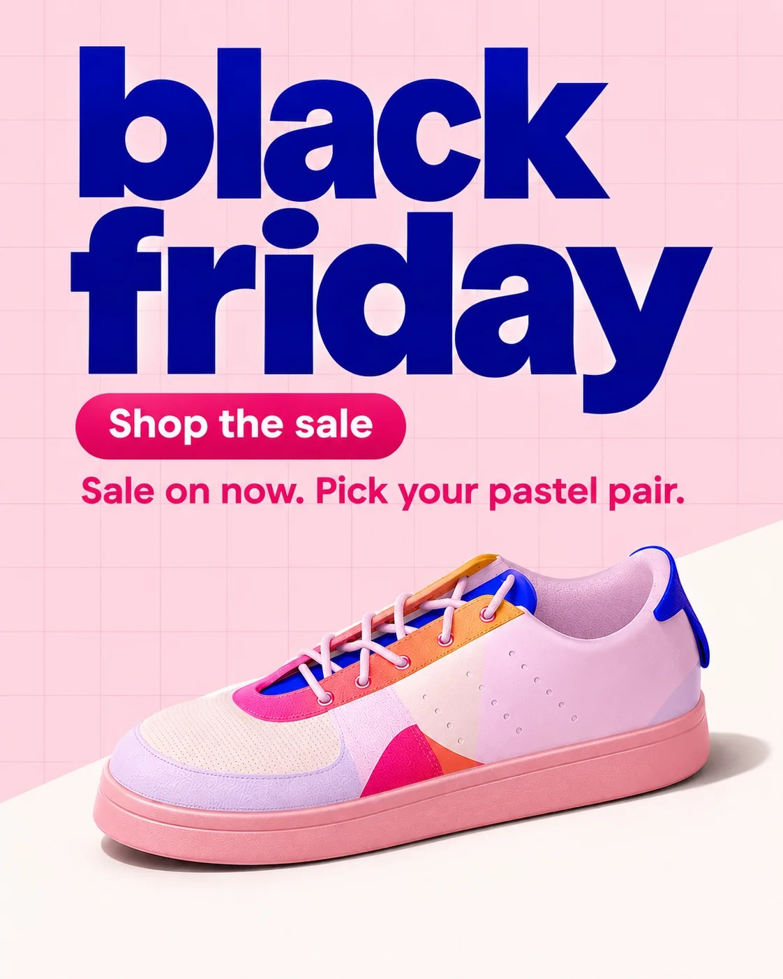
Black Friday Sale

SneakersFootwearSale AnnouncementBlack FridayOffer PromotionalDiagonal Layout
POSTER GRAMMAR — SALE ANNOUNCE DIAGONAL

[1] SUMMARY
A 4:5 portrait advertisement for sneakers: sale announce diagonal layout (offer promotional), energy, urgency mood.
Tone: bold; the viewer should feel urgency, then desire.
Idea: Announce the sale with a big lowercase headline over a pastel field, a date pill and sneakers standing on a white diagonal.

[2] REFERENCES
No reference images: everything is described in this prompt.

[3] LAYOUT
Canvas: 4:5, 1080×1350 px.
The layout was designed at 1:1; keep the same arrangement and relative positions in 4:5, extending background space rather than stretching elements.
Product: the sneakers at centre (25%–72% across, 43%–88% down), grounded with a natural contact shadow.
Text zones, in reading order:
- Headline: top centre (15%–85% across, 5%–25% down), left-aligned.
- Support: top centre (15%–85% across, 30%–34% down), left-aligned.
- CTA: top centre (15%–85% across, 26%–30% down), left-aligned.

[4] TEXT
Render exactly these strings, nothing else:
Headline: "black friday" — chunky display lettering, left-aligned.
Support: "Sale on now. Pick your pastel pair." — clean geometric sans-serif, left-aligned.
CTA: "Shop the sale" — clean geometric sans-serif, left-aligned.
Spell every word exactly as written. No extra words, numbers or labels.

[5] COLOUR
Colour weight: two balanced colours plus neutrals; high contrast. Choose the colours from the sneakers and its brand, not from any reference. Keep the sneakers's true colours; never recolour the product. Keep strong text contrast.

[6] SCENE & ART DIRECTION
Setting: baby- field with a diagonal floor and a date pill.
Art direction: Offer / Sale Graphic, Minimal Product Photography.
Light: large softbox key; realistic contact shadows.
Camera: eye-level, 50 mm lens.
Balanced spacing; every element has room.
Attention comes from: oversized headline, centred hero product.
Props: only what the layout needs; nothing that competes with the sneakers.

[7] PLATFORM
1080×1350 px, 4:5 portrait, 6% safe area on every side.

[8] RULES
No water splashes, flying droplets or puddles.
No extra text, logos, watermarks, prices or badges beyond the copy above.
Keep the sneakers sharp, correctly proportioned and recognisable at thumbnail size.
Preserve the exact copy and its hierarchy.
All text sits perfectly horizontal and upright; no slanted, tilted, curved or rotated text unless the layout above says so.
Leave clear breathing space between every element: at least 3% of the canvas height between text blocks, and between text and the product. Nothing touches or overlaps unless the layout says so.
No decorative strokes, speed lines, swooshes, arcs, sparkles, burst marks or doodles around the product or text.
Do not add water splashes, droplets, mist or a wet look, and no added texture, grain overlays or extra detailing that the brief did not ask for. Surfaces stay clean and naturally smooth.

Palette from the sneaker photo: blush background, electric blue for the big words, hot pink for the pill badge and small labels, coral accent. Centred pastel sneaker (lilac-white upper, pink sole, hot pink, coral, mustard and electric blue colour blocks on heel tab). Faint grid kept.

No logo anywhere, whatever the direction above says.
03

Sneaker Editorial Story Format

SneakersFootwearPastel SneakerGiant Number EditorialNumber 08Editorial Poster
# POSTER GRAMMAR — GIANT NUMBER EDITORIAL

## [1] SUMMARY

A 4:5 portrait advertisement for sneakers: giant number editorial layout (typographic statement), confidence, energy and contemporary fashion mood.

**Tone:** Bold, elegant, playful; the viewer should feel curiosity, desire, then confidence.

**Idea:** Make an oversized number "08" the primary visual element. Fill most of the upper portion with enormous typographic numerals, using overlapping pink, hot-pink and coral colour sections. Place a single pastel sneaker in the lower-right foreground, balanced against a compact editorial headline and supporting copy on the lower-left.

The number should function as both typography and abstract graphic artwork.

## [2] REFERENCES

No reference images: everything is described in this prompt.

## [3] LAYOUT

**Canvas:** 4:5 portrait, 1080 × 1350 px.

**Background:** Warm ivory / soft cream seamless background, with subtle natural paper-like warmth. Keep the background clean and uncluttered.

**Primary graphic:** Giant "08" occupying approximately 0%–100% across and 7%–65% down.

- The number "0" dominates the upper-left, extending beyond the left canvas edge.
- The number "8" occupies the upper-right, with its curves and counters clearly visible.
- Both numerals should use an elegant, extremely large, high-contrast editorial serif typeface.
- Divide the numerals into overlapping colour sections.
- Use blush pink as the dominant colour, hot pink for secondary sections and coral orange for smaller accent sections.
- Create a layered paper-cut or colour-block effect with clean, precise boundaries.

**Product:** One large pastel multicolour sneaker positioned in the lower-right (25%–97% across, 62%–90% down).

The sneaker should be shown in a three-quarter side view, facing towards the left. Maintain its original proportions, shape, construction and colour blocking.

Ground the sneaker with a realistic soft contact shadow.

**Text zones, in reading order:**

- **Headline:** Lower-left (5%–48% across, 62%–76% down), left-aligned, stacked across three lines.
- **Support:** Directly beneath the headline (5%–49% across, 76%–83% down), left-aligned, two lines.

Keep the sneaker and text visually balanced without unnecessary overlap.

## [4] TEXT

Render exactly these strings, nothing else:

**Primary numeral:**

"08"

Typography: Extremely large, elegant high-contrast editorial serif. Use layered blush pink, hot pink and coral colour sections.

**Headline:**

"THE
EVERYDAY
SNEAKER."

Typography: Refined editorial serif, uppercase, deep raspberry pink. Three stacked lines with tight leading and strong readability.

**Support:**

"Lightweight comfort,
made for everyday style."

Typography: Small, clean geometric sans-serif, dark raspberry pink, regular weight.

Spell every word exactly as written.

No additional labels, logos, slogans, prices or decorative text.

## [5] COLOUR

**Colour weight:** A warm neutral background combined with three saturated complementary pink and coral tones.

Suggested palette:

- Warm cream: #FFF5E9
- Blush pink: #F58AB4
- Hot pink: #ED176B
- Coral orange: #FF7047
- Raspberry: #C92C68
- Dark raspberry text: #A52A60

**Product colours must remain accurate:**

- Lilac-white upper.
- Soft blush-pink sole.
- Hot-pink overlays.
- Coral and orange lace-panel accents.
- Electric-blue tongue and heel details.
- Pale pink laces.

Never recolour the sneaker.

The typography should borrow its colours from the sneaker while maintaining a harmonious editorial palette.

## [6] SCENE & ART DIRECTION

**Setting:** Minimal warm-cream studio environment with oversized editorial typography.

**Art direction:** Swiss Editorial Design, Luxury Fashion Campaign, Contemporary Typography, Minimal Product Photography.

**Primary visual treatment:**

- Enormous serif numerals "08".
- Numerals extend beyond the canvas edges for an immersive oversized effect.
- Layered pink, magenta and coral sections create a dimensional colour-block composition.
- Use precise, smooth curves and clean intersections.
- Maintain the original legibility of both numerals.

**Product presentation:**

- One single pastel sneaker.
- Three-quarter side profile.
- Positioned in the lower-right.
- Original multicolour shoe design preserved.
- Soft studio lighting.
- Natural contact shadow beneath the sole.
- Realistic material details without excessive sharpening.

**Lighting:** Large softbox key light from the upper-left, gentle fill light and soft natural shadows.

**Camera:** Eye-level product perspective, 50 mm lens.

**Typography treatment:** The oversized number should dominate the composition. The smaller editorial headline should sit beneath it on the left, while the sneaker creates the visual counterweight on the right.

**Attention comes from:** Monumental numerals, contrasting pink colour blocks, elegant editorial typography and a beautifully rendered sneaker.

**Props:** None. Let the typography and product create the entire composition.

## [7] PLATFORM

1080 × 1350 px, 4:5 portrait.

Maintain the original relative composition.

- Giant number: upper 60% of the canvas.
- Editorial headline: lower-left.
- Sneaker: lower-right.
- Supporting text: immediately below the headline.

Maintain sufficient breathing room around the product and supporting text.

## [8] RULES

- No logos, brand names, watermarks or hashtags.
- No prices, discounts, promotional badges or CTA buttons.
- Render only the specified number and copy.
- Keep the number "08" clearly identifiable.
- Do not substitute the number with another numeral.
- Preserve the sneaker's exact original colour palette and construction.
- Keep the sneaker sharp, realistic and correctly proportioned.
- Do not introduce additional shoes or props.
- Keep the background warm cream and visually clean.
- Maintain strong contrast between the text and background.
- All text must remain horizontal, upright and correctly spelled.
- No unnecessary outlines, decorative strokes, sparkles, doodles or graphic ornaments.
- No water splashes, droplets, mist or wet effects.
- No artificial grain overlays or excessive texture.
- Avoid clutter and preserve the minimalist editorial character.

**Final visual objective:** A premium editorial sneaker campaign combining monumental pink and coral "08" typography with a pastel sneaker hero. The result should feel like a contemporary fashion magazine advertisement, where typography and product photography work together as one cohesive visual identity.
04

Product Sale Poster

SneakersFootwearUnit CubeBundle CollectionPattern BreakSurreal Product Photogra
POSTER GRAMMAR — UNIT CUBE

[1] SUMMARY
A 4:5 portrait advertisement for sneakers: unit cube layout (bundle collection), playfulness, trust mood.
Tone: witty; the viewer should feel amusement, then curiosity.
Creative direction (Built from many): Stack the units into a perfect cube with one missing and a one beside it; a dry maths joke carries the headline. Build one clear visual idea for the sneakers in this direction.

[2] REFERENCES
No reference images: everything is described in this prompt.

[3] LAYOUT
Canvas: 4:5, 1080×1350 px.
The layout was designed at 3:4; keep the same arrangement and relative positions in 4:5, extending background space rather than stretching elements.
Product: 64 sneakerss grouped together at centre (13%–85% across, 33%–88% down), grounded with a natural contact shadow.
Text zones, in reading order:
- Headline: top centre (6%–88% across, 6%–23% down), left-aligned.
- Support: top centre (6%–71% across, 24%–26% down), left-aligned.
- CTA: top-left (6%–31% across, 28%–32% down), left-aligned.

[4] TEXT
Render exactly these strings, nothing else:
Headline: "11 on the wall. Going fast." — bold condensed sans-serif, left-aligned.
Support: "The missing pair is probably your size." — clean geometric sans-serif, left-aligned.
CTA: "Find your pair" — clean geometric sans-serif, left-aligned.
Spell every word exactly as written. No extra words, numbers or labels.

[5] COLOUR
Colour weight: one dominant ground colour and a single saturated accent; high contrast. Choose the colours from the sneakers and its brand, not from any reference. Keep the sneakers's true colours; never recolour the product. Keep strong text contrast.

[6] SCENE & ART DIRECTION
Setting: a setting chosen to serve the new idea.
Art direction: Surreal Product Photography, Minimal Product Photography.
Light: large softbox key; realistic contact shadows.
Camera: eye-level, 50 mm lens.
Balanced spacing; every element has room.
Attention comes from: pattern break, joke / twist in the copy.
Props: only what the layout needs; nothing that competes with the sneakers.

[7] PLATFORM
1080×1350 px, 4:5 portrait, 6% safe area on every side.

[8] RULES
No water splashes, flying droplets or puddles.
No extra text, logos, watermarks, prices or badges beyond the copy above.
Keep the sneakers sharp, correctly proportioned and recognisable at thumbnail size.
Preserve the exact copy and its hierarchy.
All text sits perfectly horizontal and upright; no slanted, tilted, curved or rotated text unless the layout above says so.
Leave clear breathing space between every element: at least 3% of the canvas height between text blocks, and between text and the product. Nothing touches or overlaps unless the layout says so.
No decorative strokes, speed lines, swooshes, arcs, sparkles, burst marks or doodles around the product or text.
Do not add water splashes, droplets, mist or a wet look, and no added texture, grain overlays or extra detailing that the brief did not ask for. Surfaces stay clean and naturally smooth.

No logo anywhere, whatever the direction above says.
05

Product Poster

SneakersFootwearPastel SneakerGiant WordmarkGrid LayoutTypographic Statement
@Create image POSTER GRAMMAR — GIANT WORDMARK GRID\
\
[1] SUMMARY\
A 4:5 portrait advertisement for sneakers: giant wordmark grid layout (typographic statement), energy, trust mood.\
Tone: bold; the viewer should feel desire, then pride.\
Idea: Split a giant brand word around a single centred sneakers on a faint grid, with a small pill badge and fine technical labels.\
\
[2] REFERENCES\
No reference images: everything is described in this prompt.\
\
[3] LAYOUT\
Canvas: 4:5, 1080×1350 px.\
Product: the sneakers at centre (28%–73% across, 28%–68% down), grounded with a natural contact shadow.\
Text zones, in reading order:\
\- Headline: top centre (35%–90% across, 8%–22% down), left-aligned.\
\- Support: bottom-right (65%–95% across, 88%–95% down), left-aligned.\
\- CTA: top centre (35%–90% across, 23%–28% down), left-aligned.\
\
[4] TEXT\
Render exactly these strings, nothing else:\
Headline: "Pair it" — chunky display lettering, left-aligned.\
Support: "Lilac with pink, or blue with pastel. Your call." — clean geometric sans-serif, left-aligned.\
CTA: "See the look" — clean geometric sans-serif, left-aligned.\
Spell every word exactly as written. No extra words, numbers or labels.\
\
[5] COLOUR\
Colour weight: a lively multi-colour palette held together by one neutral; medium contrast. Choose the colours from the sneakers and its brand, not from any reference. Keep the sneakers's true colours; never recolour the product. Keep strong text contrast.\
\
[6] SCENE & ART DIRECTION\
Setting: grid paper with a wordmark.\
Art direction: Swiss / International Typographic Style, Minimal Product Photography.\
Light: large softbox key; realistic contact shadows.\
Camera: eye-level, 50 mm lens.\
Balanced spacing; every element has room.\
Attention comes from: oversized headline, centred hero product.\
Props: only what the layout needs; nothing that competes with the sneakers.\
\
[7] PLATFORM\
1080×1350 px, 4:5 portrait, 6% safe area on every side.\
\
[8] RULES\
No water splashes, flying droplets or puddles.\
No extra text, logos, watermarks, prices or badges beyond the copy above.\
Keep the sneakers sharp, correctly proportioned and recognisable at thumbnail size.\
Preserve the exact copy and its hierarchy.\
All text sits perfectly horizontal and upright; no slanted, tilted, curved or rotated text unless the layout above says so.\
Leave clear breathing space between every element: at least 3% of the canvas height between text blocks, and between text and the product. Nothing touches or overlaps unless the layout says so.\
No decorative strokes, speed lines, swooshes, arcs, sparkles, burst marks or doodles around the product or text.\
Do not add water splashes, droplets, mist or a wet look, and no added texture, grain overlays or extra detailing that the brief did not ask for. Surfaces stay clean and naturally smooth.\
\
The client also asked for: Palette from the sneaker photo: blush background, electric blue for the big words, hot pink for the pill badge and small labels, coral accent. Centred pastel sneaker (lilac-white upper, pink sole, hot pink, coral, mustard and electric blue colour blocks on heel tab). Faint grid kept.\
\
No logo anywhere, whatever the direction above says.

Turn any of these into your own poster

Poster Grammar's Art Director agent takes your product and brand and builds the poster, the copy and the prompt for you. No prompting skills needed.